Brand Identity and Digital Design for a Handmade Accessories Brand
Brand Identity and Digital Design for a Handmade Accessories Brand
Brand Identity and Digital Design for a Handmade Accessories Brand
Brand Identity and Digital Design for a Handmade Accessories Brand
ABOUT PROJECT
The goal was to create a playful and recognizable identity for Dredhëz Handmade, an accessories brand inspired by strawberries and the Albanian letter “Ë.” Custom typography, organic graphic forms, and a bold red-and-pink palette give the brand a youthful and expressive personality that remains consistent across packaging and social media.
ABOUT PROJECT
The goal was to create a playful and recognizable identity for Dredhëz Handmade, an accessories brand inspired by strawberries and the Albanian letter “Ë.” Custom typography, organic graphic forms, and a bold red-and-pink palette give the brand a youthful and expressive personality that remains consistent across packaging and social media.
ABOUT PROJECT
The goal was to create a playful and recognizable identity for Dredhëz Handmade, an accessories brand inspired by strawberries and the Albanian letter “Ë.” Custom typography, organic graphic forms, and a bold red-and-pink palette give the brand a youthful and expressive personality that remains consistent across packaging and social media.


Challenges & Solutions
Problem
Dredhëz Handmade entered a crowded accessories market where many handmade brands rely on similar neutral and traditional craft aesthetics. The challenge was to create an identity that felt distinctive and youthful while communicating the care, quality, and craftsmanship behind every handmade piece.
Solution
I transformed the Albanian letter “Ë” into a memorable strawberry-inspired symbol. A bold red-and-pink palette, playful organic forms, and clean typography give Dredhëz Handmade a warm and modern personality. Applied across packaging, branded materials, and social media, the identity remains expressive, recognizable, and consistent.
Challenges & Solutions
Problem
Dredhëz Handmade entered a crowded accessories market where many handmade brands rely on similar neutral and traditional craft aesthetics. The challenge was to create an identity that felt distinctive and youthful while communicating the care, quality, and craftsmanship behind every handmade piece.
Solution
I transformed the Albanian letter “Ë” into a memorable strawberry-inspired symbol. A bold red-and-pink palette, playful organic forms, and clean typography give Dredhëz Handmade a warm and modern personality. Applied across packaging, branded materials, and social media, the identity remains expressive, recognizable, and consistent.
Challenges & Solutions
Problem
Dredhëz Handmade entered a crowded accessories market where many handmade brands rely on similar neutral and traditional craft aesthetics. The challenge was to create an identity that felt distinctive and youthful while communicating the care, quality, and craftsmanship behind every handmade piece.
Solution
I transformed the Albanian letter “Ë” into a memorable strawberry-inspired symbol. A bold red-and-pink palette, playful organic forms, and clean typography give Dredhëz Handmade a warm and modern personality. Applied across packaging, branded materials, and social media, the identity remains expressive, recognizable, and consistent.
Process
Design
Process
Design
Process
Design

Logo
Design
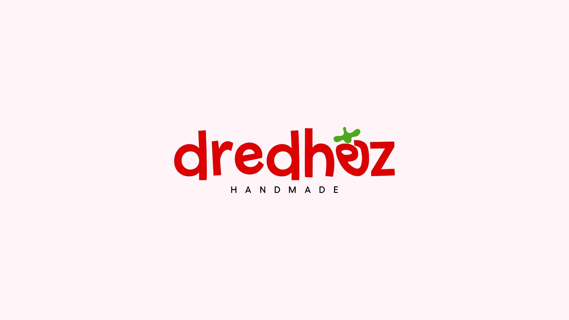
The client wanted a playful yet refined identity that reflected the handmade character of Dredhëz Handmade. Inspired by the brand name meaning “strawberry” in Albanian. I transformed the lowercase letter “ë” into a distinctive strawberry-inspired symbol. Its rounded form and vibrant colour palette communicate warmth, creativity, and care, while the clean typography keeps the identity modern and versatile across packaging, branded materials, and digital platforms.
Logo
Design
The client wanted a playful yet refined identity that reflected the handmade character of Dredhëz Handmade. Inspired by the brand name meaning “strawberry” in Albanian. I transformed the lowercase letter “ë” into a distinctive strawberry-inspired symbol. Its rounded form and vibrant colour palette communicate warmth, creativity, and care, while the clean typography keeps the identity modern and versatile across packaging, branded materials, and digital platforms.
Logo
Design
The client wanted a playful yet refined identity that reflected the handmade character of Dredhëz Handmade. Inspired by the brand name meaning “strawberry” in Albanian. I transformed the lowercase letter “ë” into a distinctive strawberry-inspired symbol. Its rounded form and vibrant colour palette communicate warmth, creativity, and care, while the clean typography keeps the identity modern and versatile across packaging, branded materials, and digital platforms.

Brand
Guidelines
Dredhëz Handmade’s brand guidelines establish a clear framework for applying the identity across print and digital platforms. From the strawberry-inspired logo and vibrant colour palette to typography and organic graphic forms, every element works together as part of one cohesive system. This consistency keeps the brand playful, recognizable, and expressive across packaging, stationery, social media, and other branded applications.
Brand
Guidelines
Dredhëz Handmade’s brand guidelines establish a clear framework for applying the identity across print and digital platforms. From the strawberry-inspired logo and vibrant colour palette to typography and organic graphic forms, every element works together as part of one cohesive system. This consistency keeps the brand playful, recognizable, and expressive across packaging, stationery, social media, and other branded applications.
Brand
Guidelines
Dredhëz Handmade’s brand guidelines establish a clear framework for applying the identity across print and digital platforms. From the strawberry-inspired logo and vibrant colour palette to typography and organic graphic forms, every element works together as part of one cohesive system. This consistency keeps the brand playful, recognizable, and expressive across packaging, stationery, social media, and other branded applications.


Colors &
Typography
Colors &
Typography
Colors &
Typography


Materials
Dredhëz Handmade’s visual identity extends across print through strawberry-inspired graphics, vibrant colours, and clean typography. Applied to business cards, packaging, stationery, and other branded materials, the system creates a cohesive and recognizable presence while preserving the brand’s playful, handcrafted character.
Materials
Dredhëz Handmade’s visual identity extends across print through strawberry-inspired graphics, vibrant colours, and clean typography. Applied to business cards, packaging, stationery, and other branded materials, the system creates a cohesive and recognizable presence while preserving the brand’s playful, handcrafted character.
Materials
Dredhëz Handmade’s visual identity extends across print through strawberry-inspired graphics, vibrant colours, and clean typography. Applied to business cards, packaging, stationery, and other branded materials, the system creates a cohesive and recognizable presence while preserving the brand’s playful, handcrafted character.


Social
Media
Social
Media
Social
Media
Results
+60%
VISUAL COHESION
The unified logo, colour palette, typography, and graphic elements created a consistent brand presence across every physical and digital touchpoint.
+40%
CUSTOMER CONNECTION
The playful strawberry-inspired visuals and warm personality helped Dredhëz feel more approachable and connect naturally with its audience.
3-4 weeks
INDENTITY DEVELOPMENT
The complete brand was developed from initial research and concept exploration to final guidelines and real-world applications.
3x
BRAND MEMORABILITY
The distinctive “ë” symbol, vibrant colours, and handcrafted character made Dredhëz instantly recognizable across every platform.
Results
+60%
VISUAL COHESION
The unified logo, colour palette, typography, and graphic elements created a consistent brand presence across every physical and digital touchpoint.
+40%
CUSTOMER CONNECTION
The playful strawberry-inspired visuals and warm personality helped Dredhëz feel more approachable and connect naturally with its audience.
3-4 weeks
INDENTITY DEVELOPMENT
The complete brand was developed from initial research and concept exploration to final guidelines and real-world applications.
3x
BRAND MEMORABILITY
The distinctive “ë” symbol, vibrant colours, and handcrafted character made Dredhëz instantly recognizable across every platform.
Results
+60%
VISUAL COHESION
The unified logo, colour palette, typography, and graphic elements created a consistent brand presence across every physical and digital touchpoint.
+40%
CUSTOMER CONNECTION
The playful strawberry-inspired visuals and warm personality helped Dredhëz feel more approachable and connect naturally with its audience.
3-4 weeks
INDENTITY DEVELOPMENT
The complete brand was developed from initial research and concept exploration to final guidelines and real-world applications.
3x
BRAND MEMORABILITY
The distinctive “ë” symbol, vibrant colours, and handcrafted character made Dredhëz instantly recognizable across every platform.
"Working with Jeton felt like having a seasoned design partner who truly understood our vision for and brought it to life in ways we hadn't even imagined."

Vesa Gashi
Founder of Dredhëz Handmade
"Working with Jeton felt like having a seasoned design partner who truly understood our vision for and brought it to life in ways we hadn't even imagined."
Vesa Gashi
Founder of Dredhëz Handmade
More Projects


Trusted by many
Trusted by many





50+ Happy clients
Like what you see?
Book a free discovery call.
50+ Happy clients