Brand and Digital Design for an Agency
Brand and Digital Design for an Agency
Brand and Digital Design for an Agency
Brand and Digital Design for an Agency

ABOUT PROJECT
Reina Studio Agency was designed as a modern branding concept for a creative studio that values clarity, confidence, and craftsmanship. The goal was to create a visual identity that feels premium yet approachable, using a geometric logo, clean typography, and a refined teal-and-emerald color palette to communicate precision, balance, and consistency across every brand touchpoint.
ABOUT PROJECT
Reina Studio Agency was designed as a modern branding concept for a creative studio that values clarity, confidence, and craftsmanship. The goal was to create a visual identity that feels premium yet approachable, using a geometric logo, clean typography, and a refined teal-and-emerald color palette to communicate precision, balance, and consistency across every brand touchpoint.
ABOUT PROJECT
Reina Studio Agency was designed as a modern branding concept for a creative studio that values clarity, confidence, and craftsmanship. The goal was to create a visual identity that feels premium yet approachable, using a geometric logo, clean typography, and a refined teal-and-emerald color palette to communicate precision, balance, and consistency across every brand touchpoint.


Challenges & Solutions
Problem
The creative market is crowded with studios using similar visual styles, messaging, and promises. The challenge was to position Reina as a distinctive agency that feels premium and modern while communicating its services with clarity, confidence, and a strong sense of trust.
Solution
I created a refined brand identity built around strategic simplicity, geometric forms, a distinctive teal palette, and a clear visual hierarchy. Every element from the logo and typography to the tone of voice and brand applications works together to express creativity, precision, and professionalism, helping Reina deliver a consistent and memorable experience across every touchpoint.
Challenges & Solutions
Problem
The creative market is crowded with studios using similar visual styles, messaging, and promises. The challenge was to position Reina as a distinctive agency that feels premium and modern while communicating its services with clarity, confidence, and a strong sense of trust.
Solution
I created a refined brand identity built around strategic simplicity, geometric forms, a distinctive teal palette, and a clear visual hierarchy. Every element from the logo and typography to the tone of voice and brand applications works together to express creativity, precision, and professionalism, helping Reina deliver a consistent and memorable experience across every touchpoint.
Challenges & Solutions
Problem
The creative market is crowded with studios using similar visual styles, messaging, and promises. The challenge was to position Reina as a distinctive agency that feels premium and modern while communicating its services with clarity, confidence, and a strong sense of trust.
Solution
I created a refined brand identity built around strategic simplicity, geometric forms, a distinctive teal palette, and a clear visual hierarchy. Every element from the logo and typography to the tone of voice and brand applications works together to express creativity, precision, and professionalism, helping Reina deliver a consistent and memorable experience across every touchpoint.
Design
Process
Design
Process
Design
Process
Logo
Design
The Reina icon is the defining element of the brand identity. Constructed from sharp geometric forms, it offers an abstract interpretation of the letter “R” while suggesting movement, transformation, and forward momentum. Its folded structure adds depth and an architectural quality, reinforcing the brand’s sense of precision, creativity, and attention to detail.
Logo
Design
The Reina icon is the defining element of the brand identity. Constructed from sharp geometric forms, it offers an abstract interpretation of the letter “R” while suggesting movement, transformation, and forward momentum. Its folded structure adds depth and an architectural quality, reinforcing the brand’s sense of precision, creativity, and attention to detail.
Logo
Design
The Reina icon is the defining element of the brand identity. Constructed from sharp geometric forms, it offers an abstract interpretation of the letter “R” while suggesting movement, transformation, and forward momentum. Its folded structure adds depth and an architectural quality, reinforcing the brand’s sense of precision, creativity, and attention to detail.


Brand
Guidelines
Reina’s brand guidelines establish a clear framework for applying the identity across digital and print. From logo usage, colour, and typography to imagery and tone of voice, every element works as part of one cohesive system. This consistency helps the brand remain refined, recognizable, and confident across every touchpoint.
Brand
Guidelines
Reina’s brand guidelines establish a clear framework for applying the identity across digital and print. From logo usage, colour, and typography to imagery and tone of voice, every element works as part of one cohesive system. This consistency helps the brand remain refined, recognizable, and confident across every touchpoint.
Brand
Guidelines
Reina’s brand guidelines establish a clear framework for applying the identity across digital and print. From logo usage, colour, and typography to imagery and tone of voice, every element works as part of one cohesive system. This consistency helps the brand remain refined, recognizable, and confident across every touchpoint.


Colors &
Typography
Colors &
Typography
Colors &
Typography


Materials
Reina’s identity extends seamlessly into print through consistent typography, geometric forms, and signature colours, creating a refined and recognizable presence across every physical touchpoint.
Materials
Reina’s identity extends seamlessly into print through consistent typography, geometric forms, and signature colours, creating a refined and recognizable presence across every physical touchpoint.
Materials
Reina’s identity extends seamlessly into print through consistent typography, geometric forms, and signature colours, creating a refined and recognizable presence across every physical touchpoint.


Digital
Campaign
Digital
Campaign
Digital
Campaign


Web
Design
Web
Design
Web
Design

3D
Logo
3D
Logo
3D
Logo


Results
+60%
Brand Consistency
A unified identity system created a stronger and more recognizable presence across every platform.
+29%
Audience Engagement
Clearer visuals and refined communication helped the brand connect more effectively with its audience.
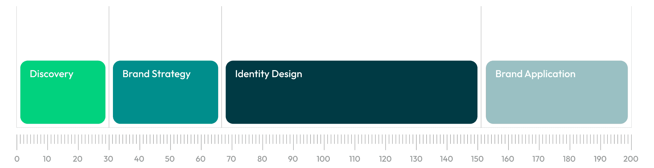
5 Weeks
Project Timeline
The complete identity was developed from discovery and strategy to final brand applications.
3x
Stronger Recognition
The distinctive icon, typography, and colour palette made the brand easier to identify and remember.
Results
+60%
Brand Consistency
A unified identity system created a stronger and more recognizable presence across every platform.
+29%
Audience Engagement
Clearer visuals and refined communication helped the brand connect more effectively with its audience.
5 Weeks
Project Timeline
The complete identity was developed from discovery and strategy to final brand applications.
3x
Stronger Recognition
The distinctive icon, typography, and colour palette made the brand easier to identify and remember.
Results
+60%
Brand Consistency
A unified identity system created a stronger and more recognizable presence across every platform.
+29%
Audience Engagement
Clearer visuals and refined communication helped the brand connect more effectively with its audience.
5 Weeks
Project Timeline
The complete identity was developed from discovery and strategy to final brand applications.
3x
Stronger Recognition
The distinctive icon, typography, and colour palette made the brand easier to identify and remember.
"Jeton's attention to detail made our studio stand out in a crowded market."

Shkelqim Gerguri
CEO at Reina Studio Agency
"Jeton's attention to detail made our studio stand out in a crowded market."
Shkelqim Gerguri
CEO at Reina Studio Agency
More Projects

Trusted by many
Trusted by many





50+ Happy clients
Like what you see?
Book a free discovery call.
50+ Happy clients